Texas Capital didn’t need to look louder. They needed to look truer.
This is a bank built in Texas, serving people who take pride in what they’ve built founders, makers, families, and institutions that expect excellence without pretense.
The old identity wasn’t wrong. It just wasn’t fully carrying the weight of who they were becoming. The work was about balance: premium but not pretentious, bold but not arrogant, refined but still human.
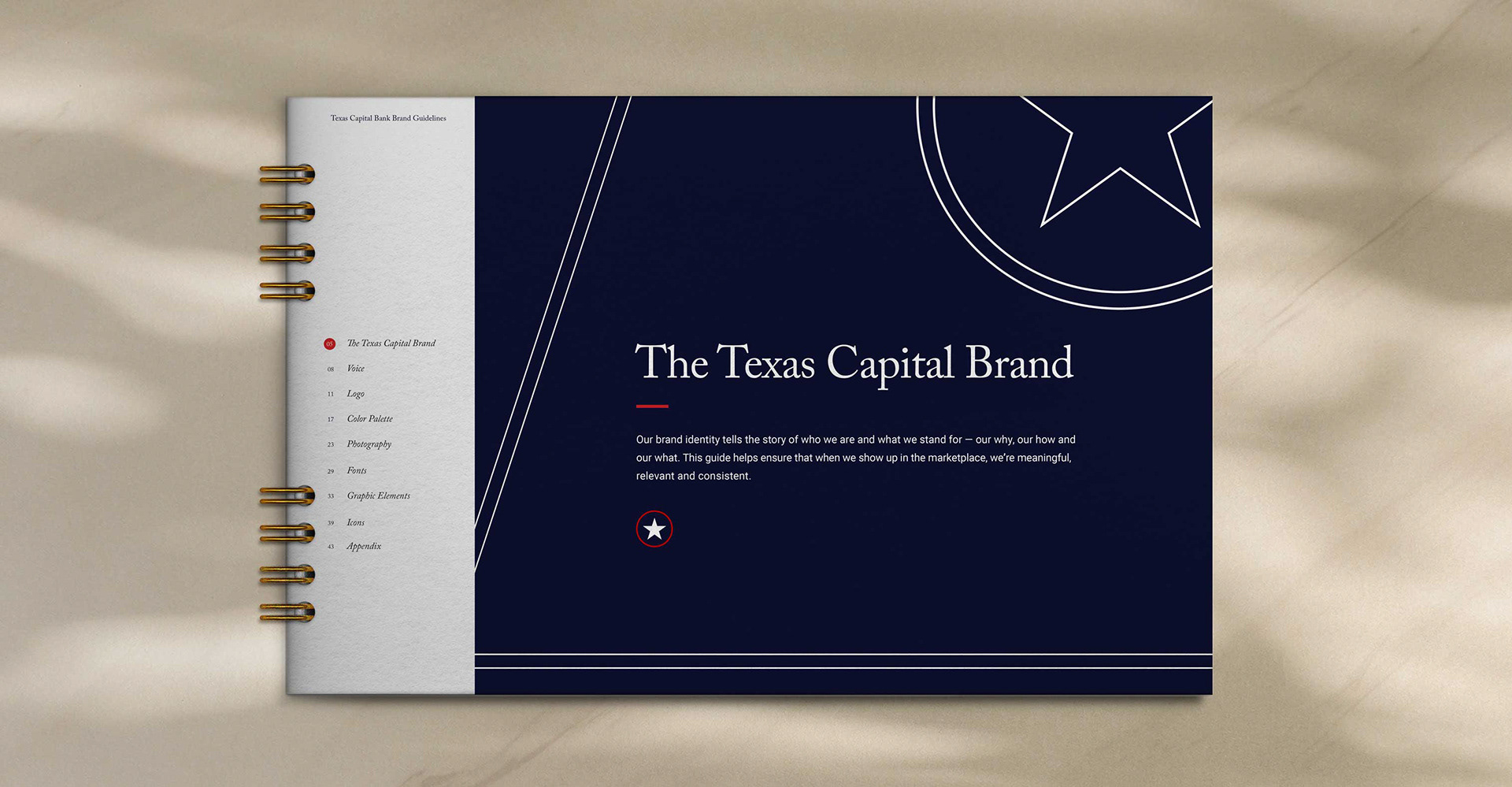
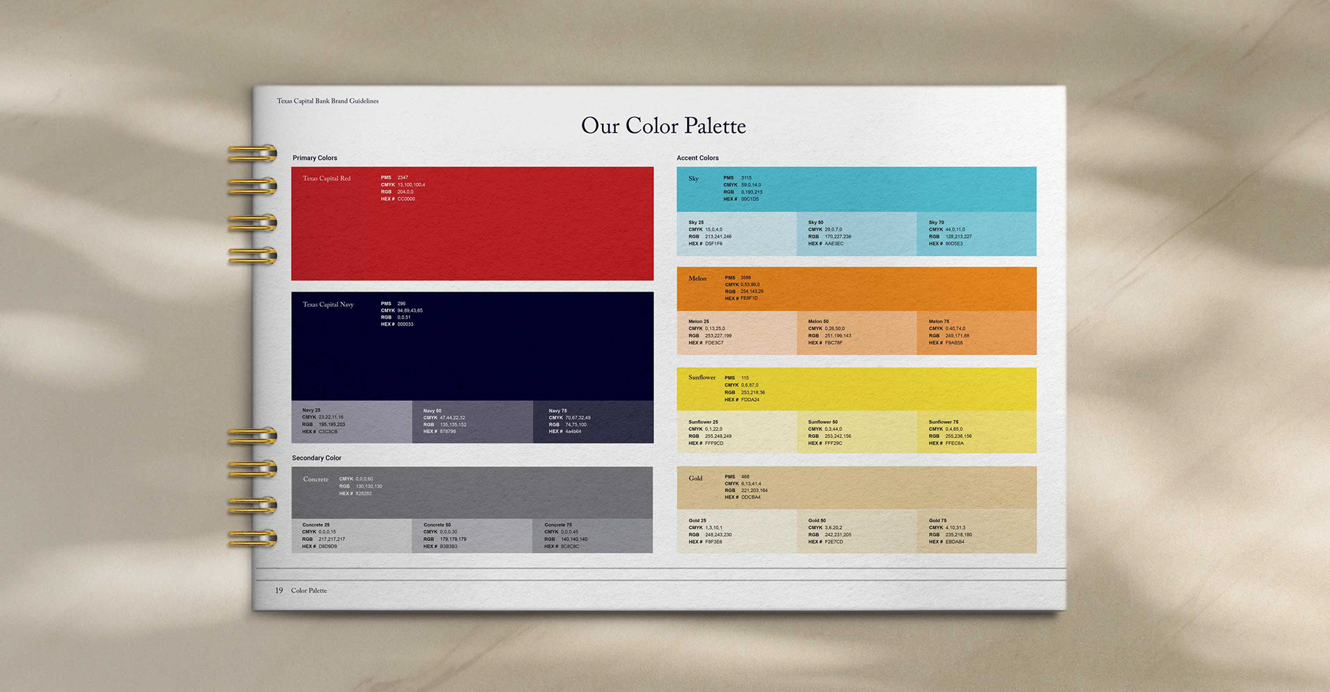
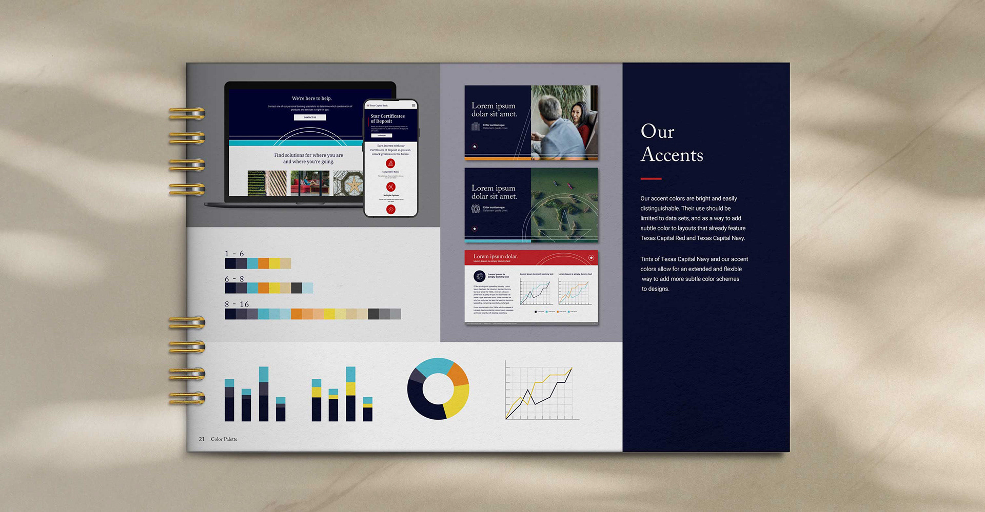
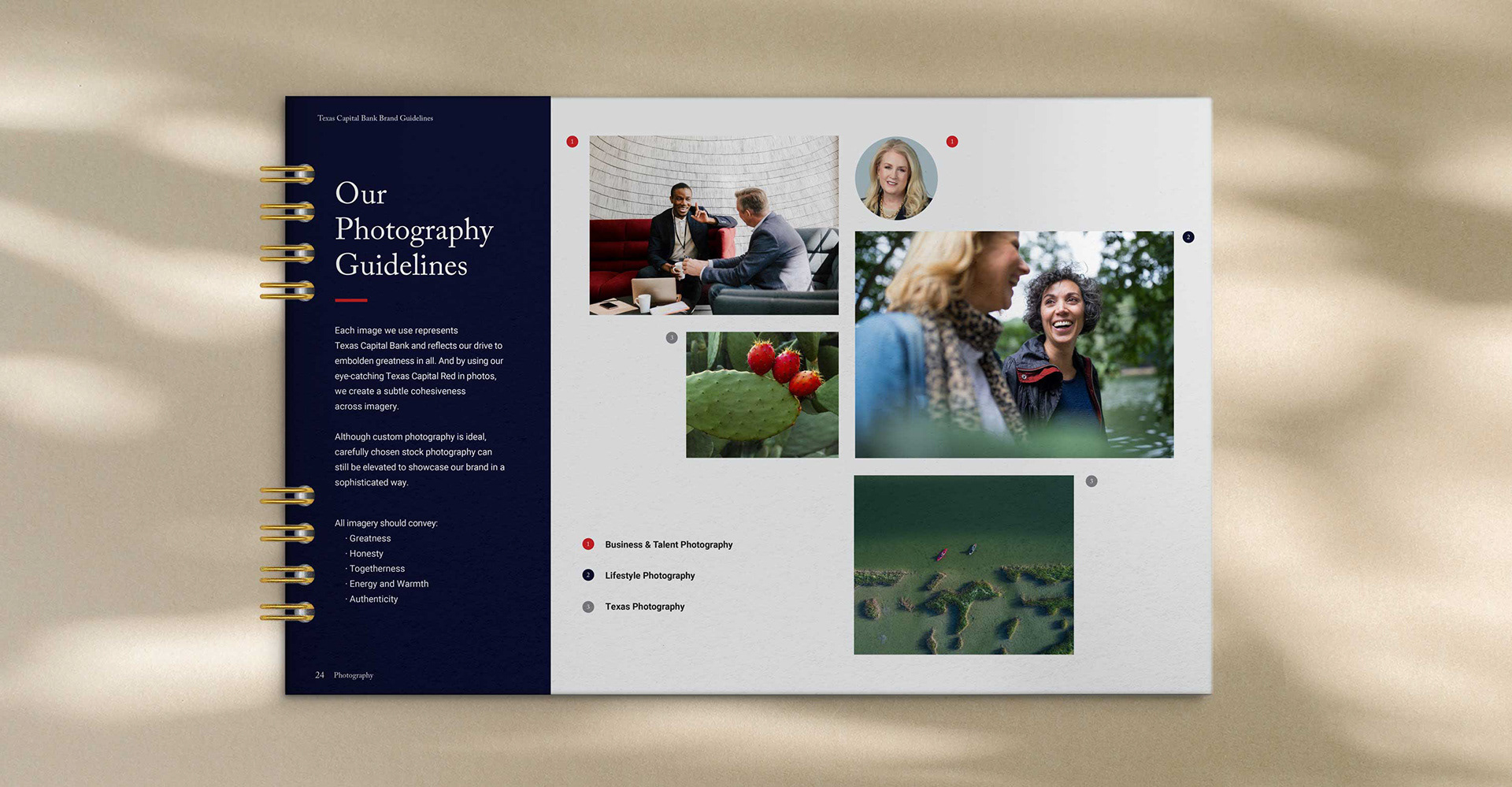
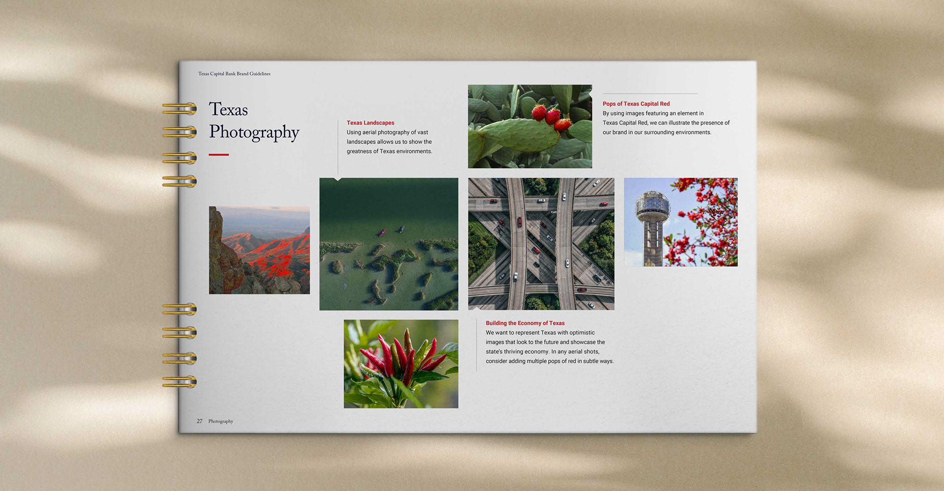
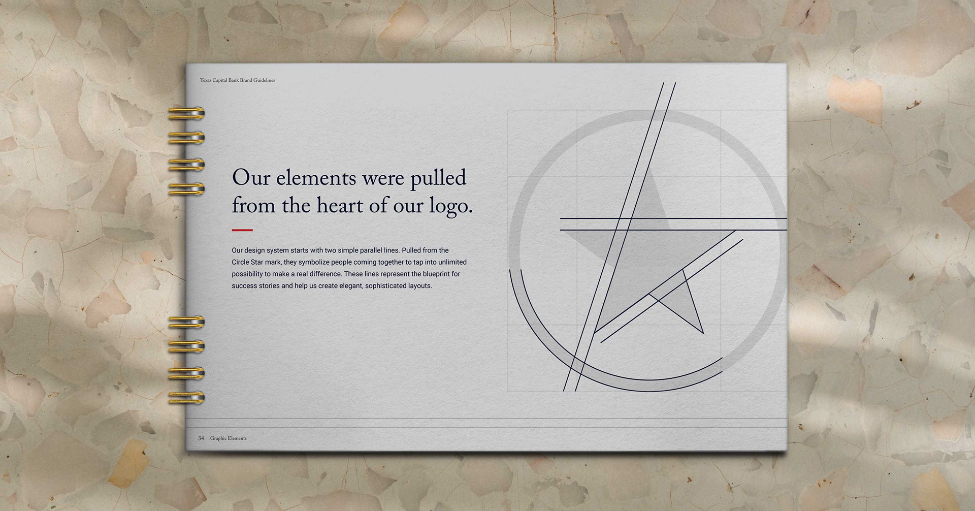
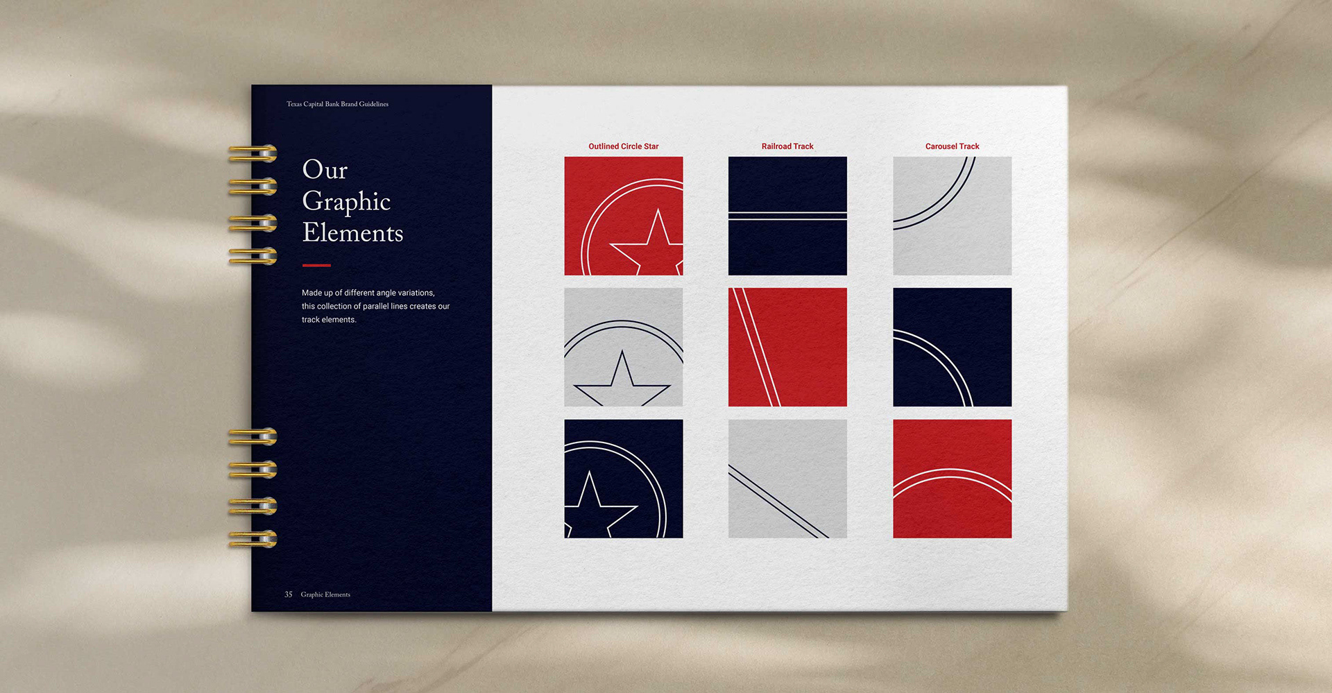
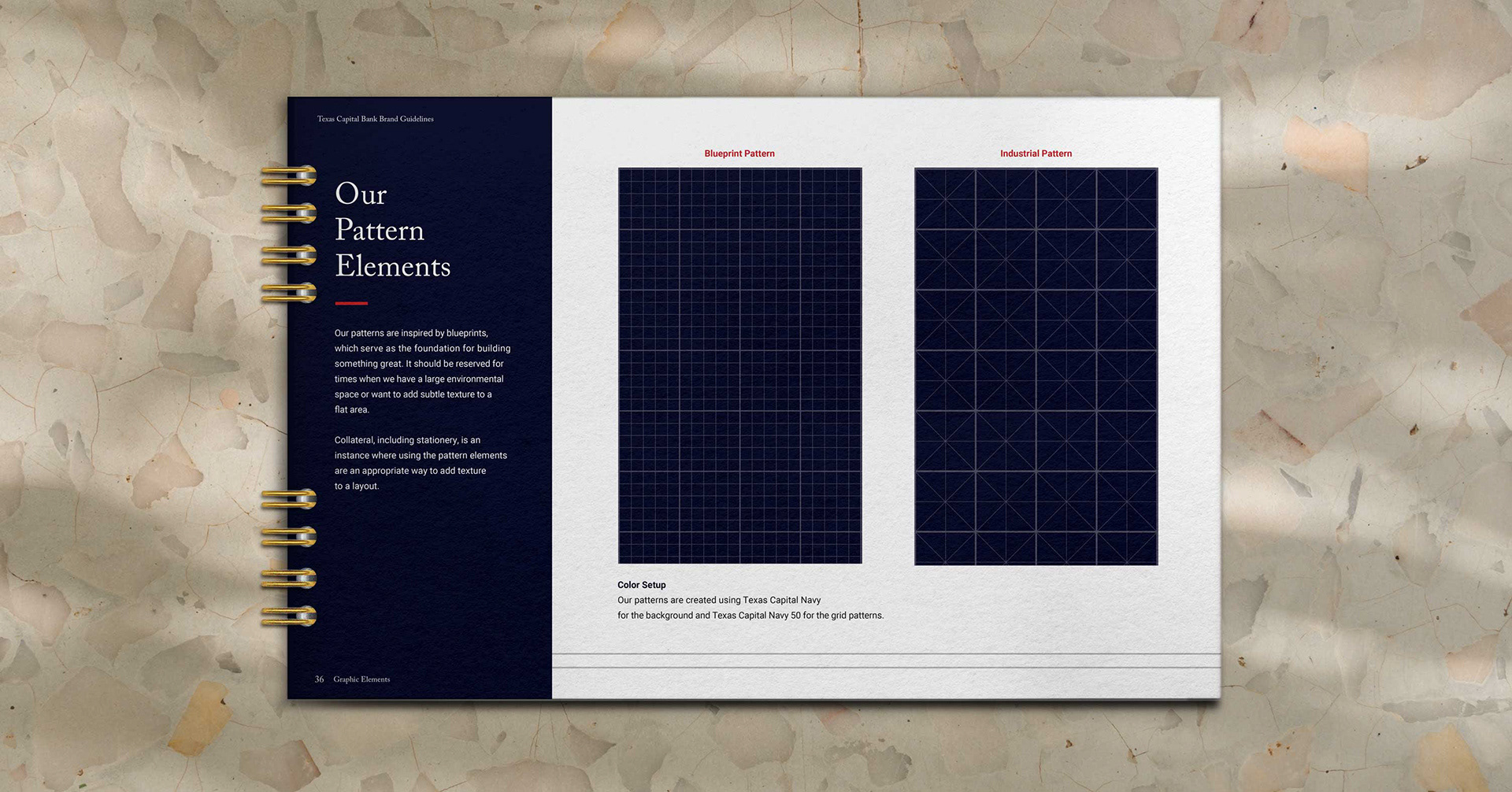
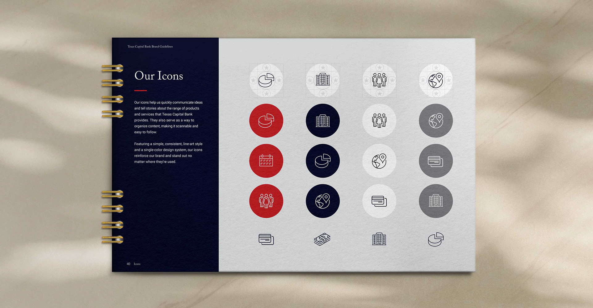
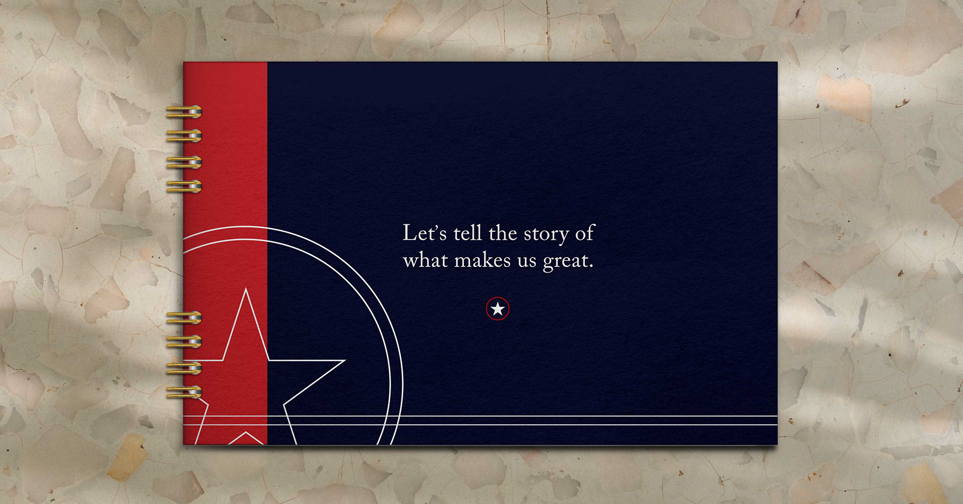
I was deeply involved in shaping Texas Capital’s new visual story building a system that could feel elevated and modern while still grounded in confidence and approachability. From core design elements to photography direction and layout behavior, we crafted a brand wardrobe that could scale, not just for one campaign, but for every place the bank shows up.
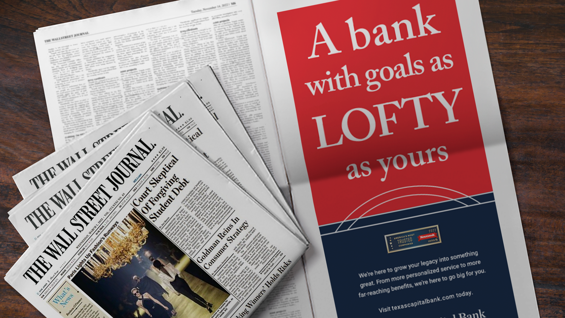
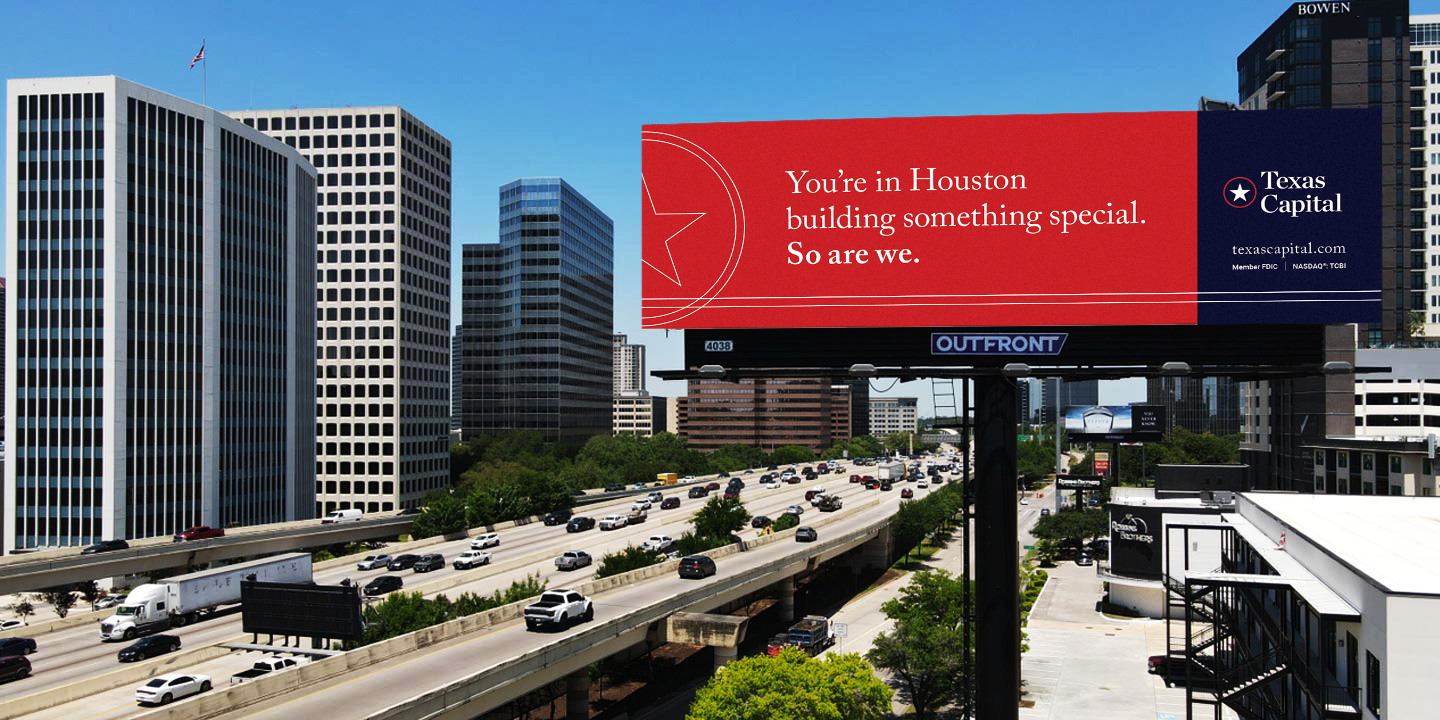
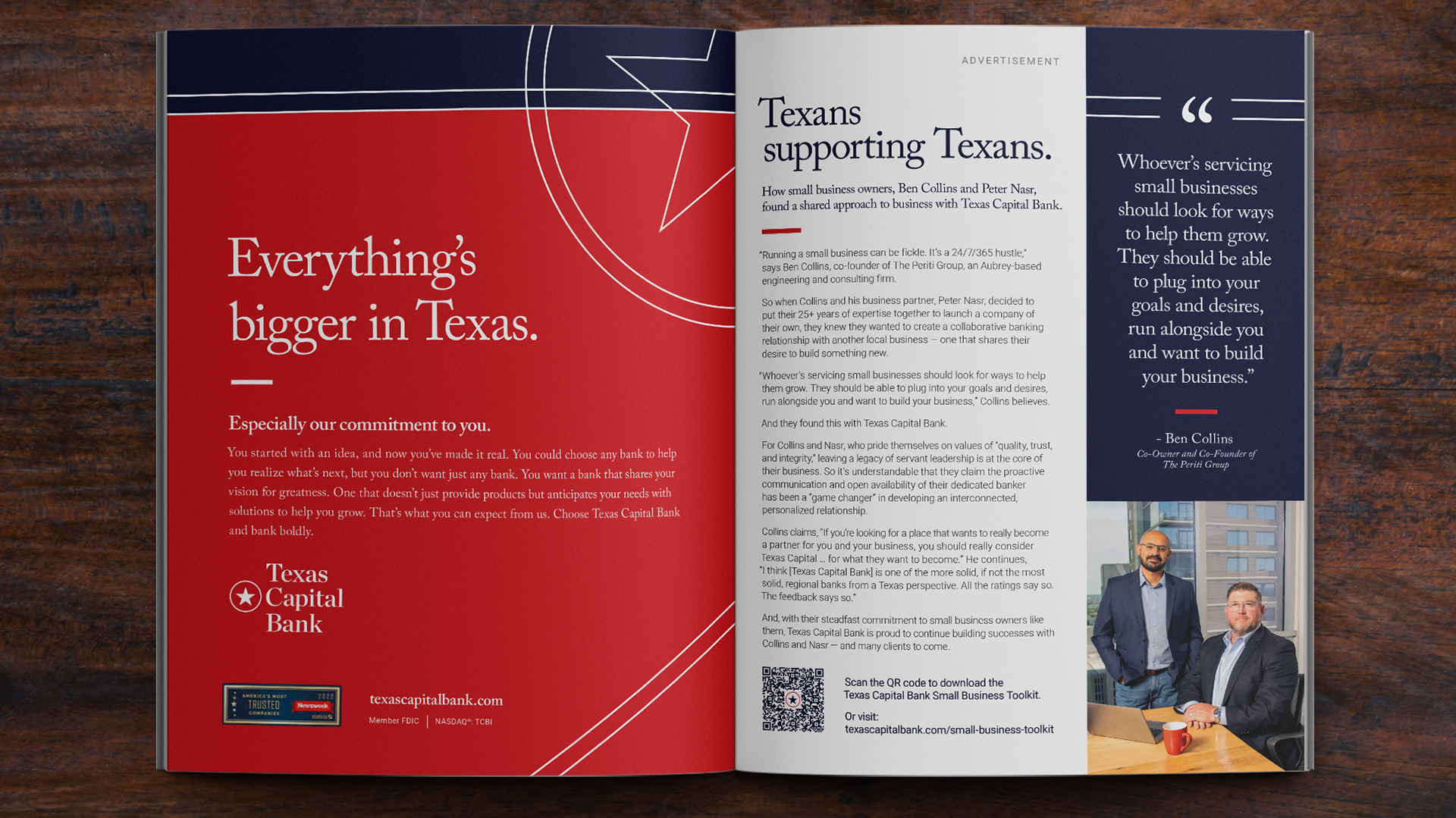
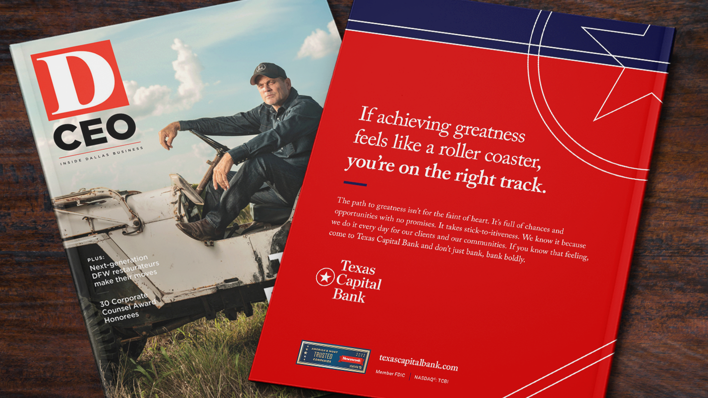
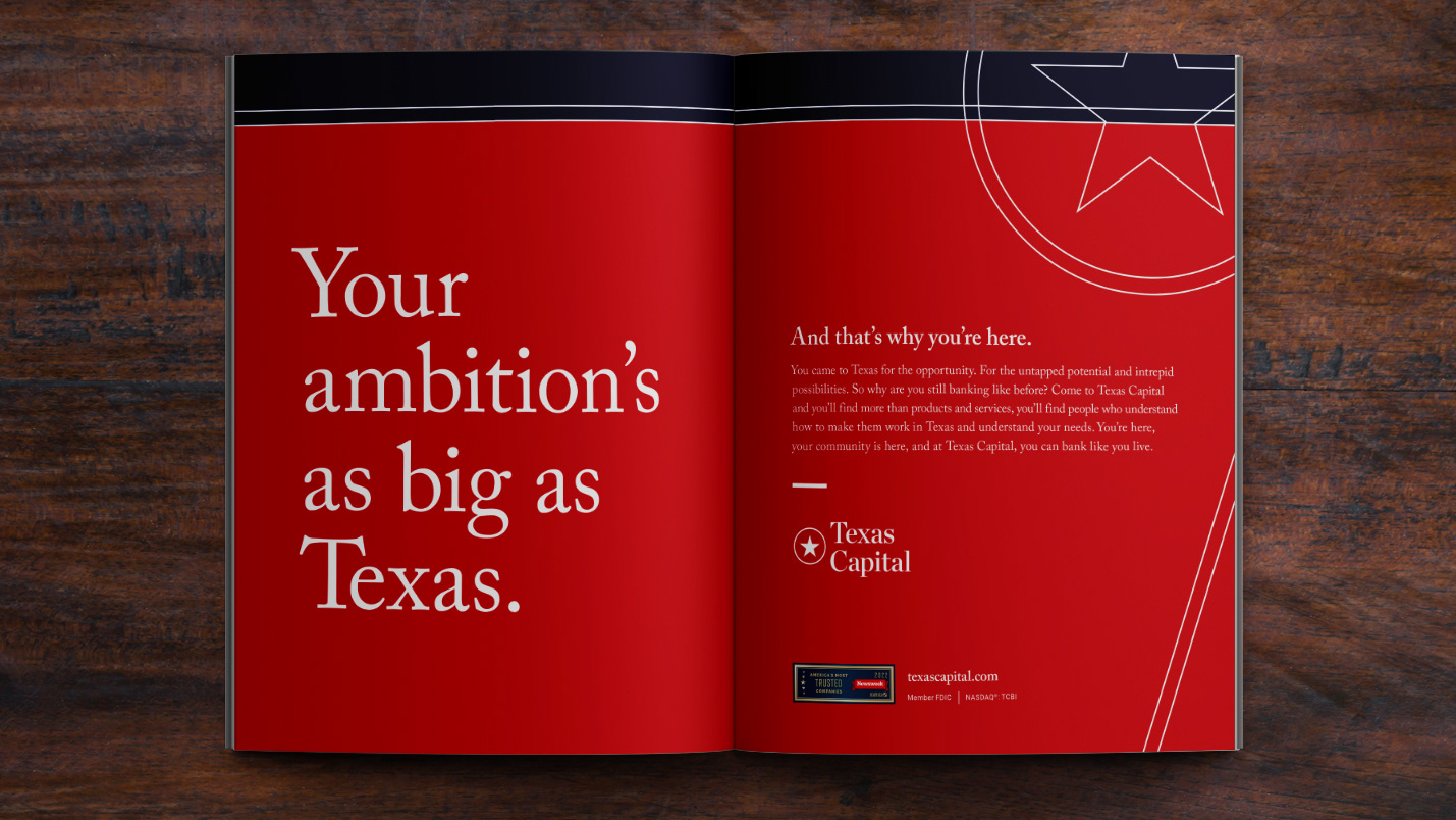
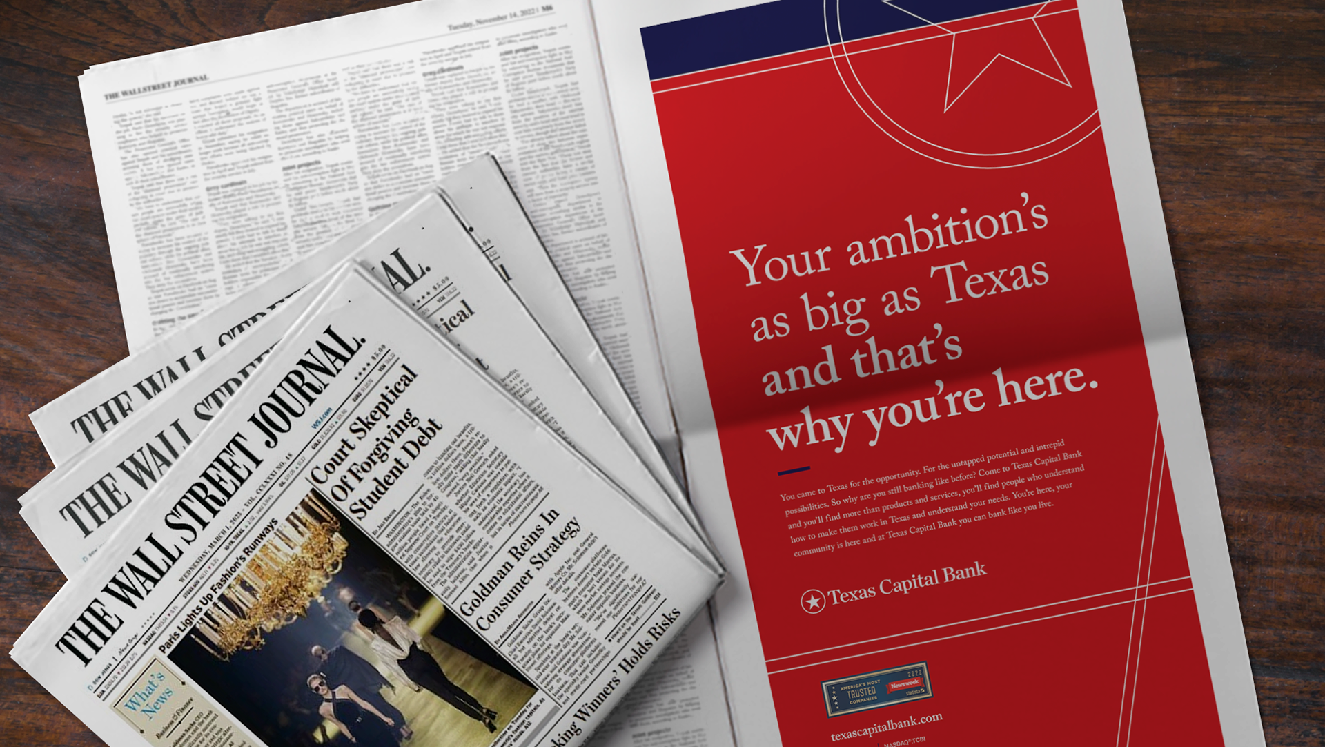
Then we took it to market. “Bank Boldly” became the line that proved the system worked in real life — appearing across major Texas markets and translating the identity into a message people could feel in a glance: Texas Capital is here, and it’s built for what’s next.
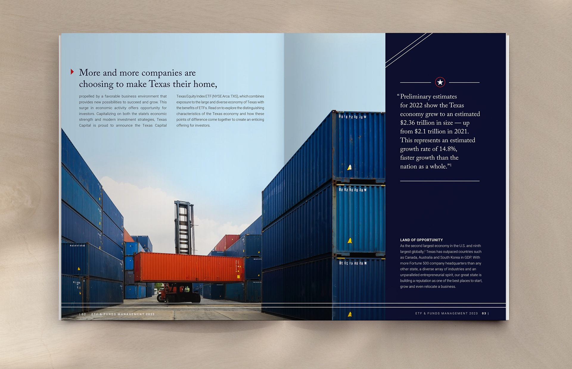
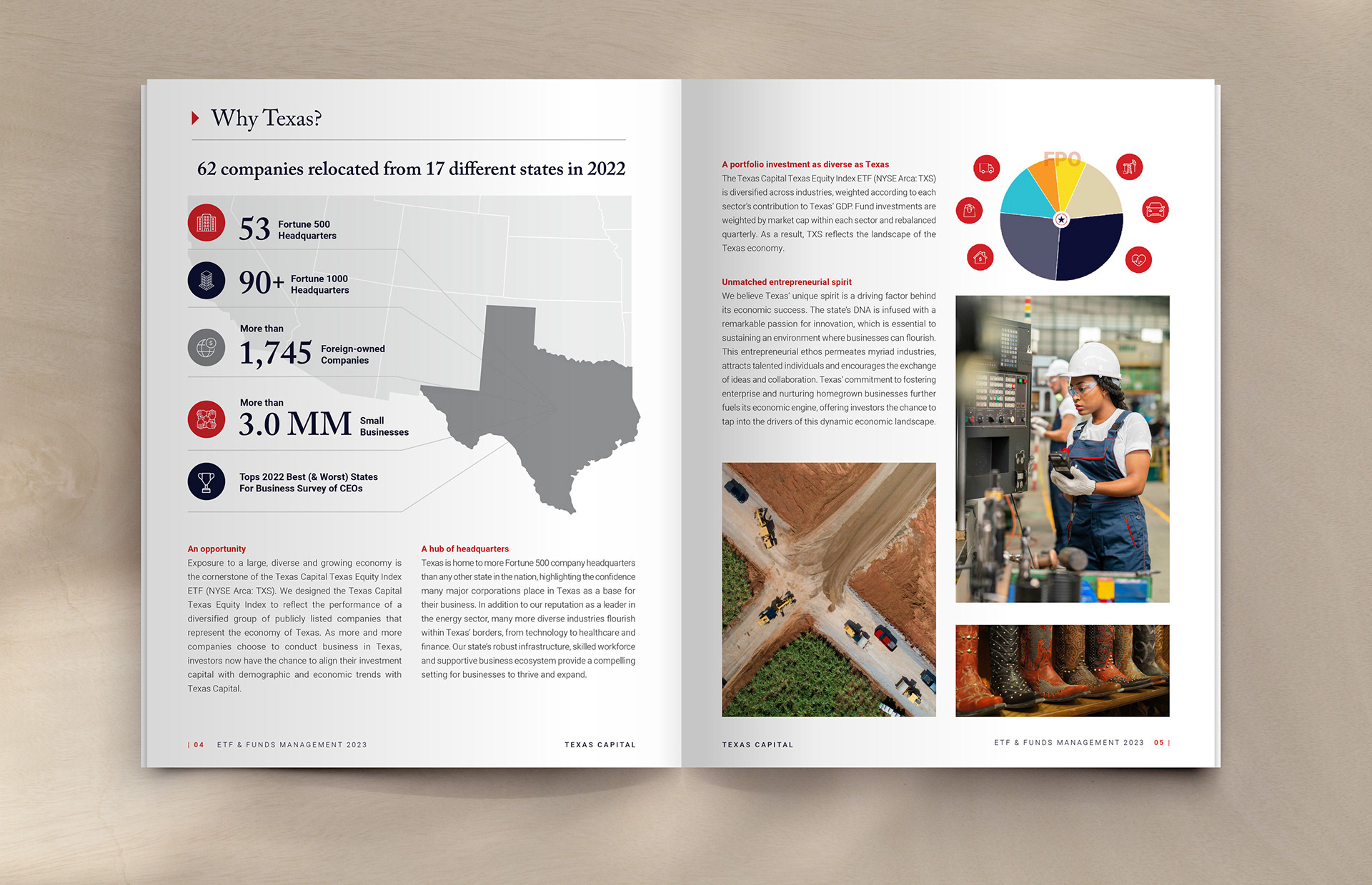
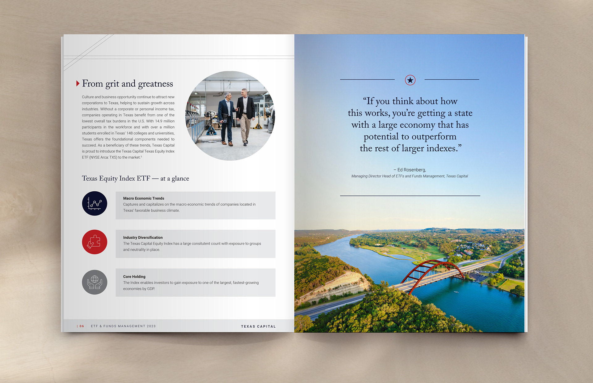
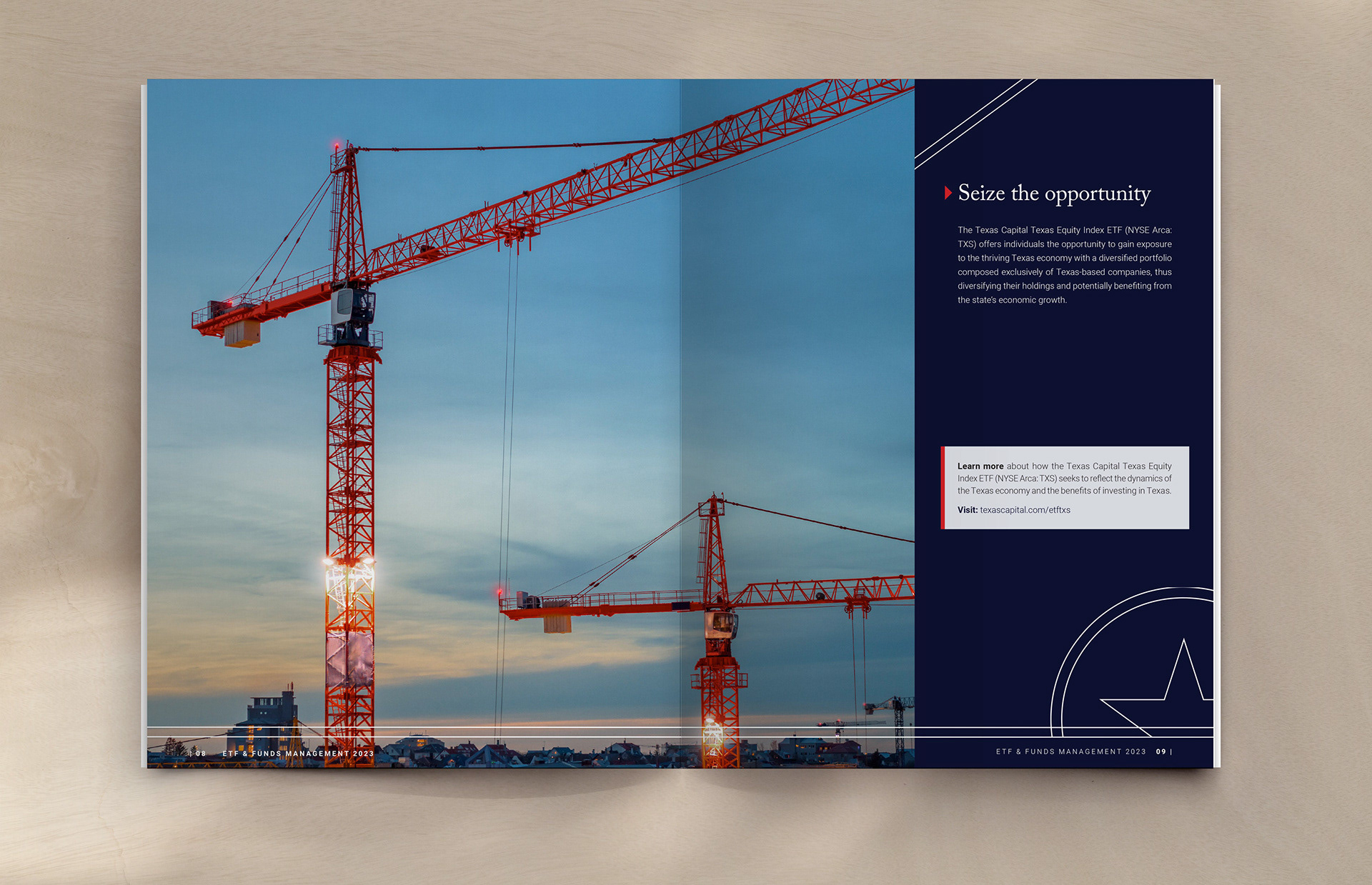
My role as an art director was heavy involvement in visual direction and system building. Concepting, design development, and execution across identity and launch applications guided by Creative Direction from Roneka Patterson.

