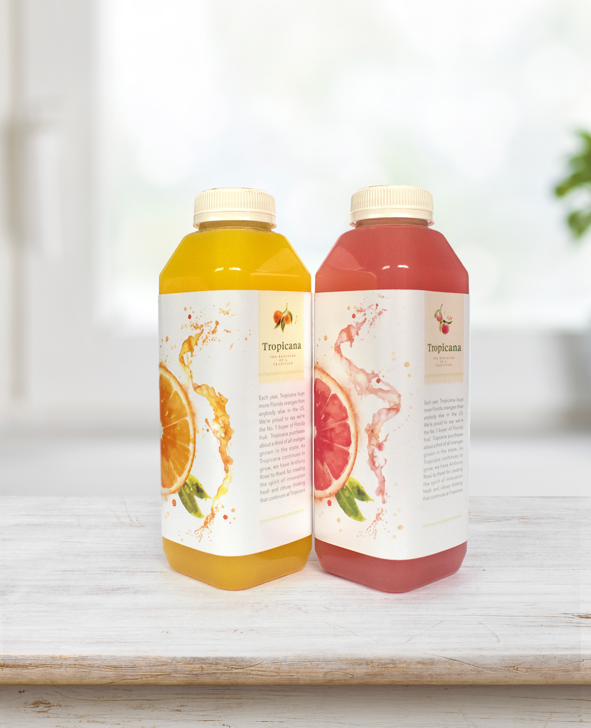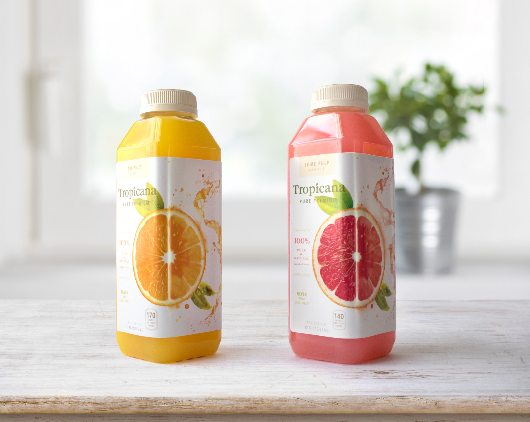

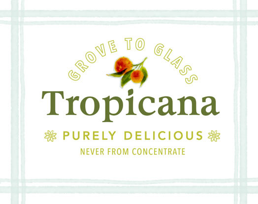
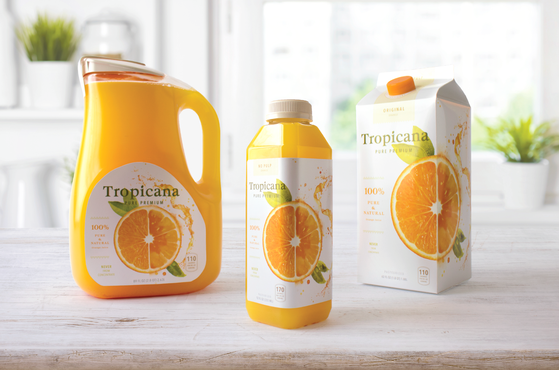
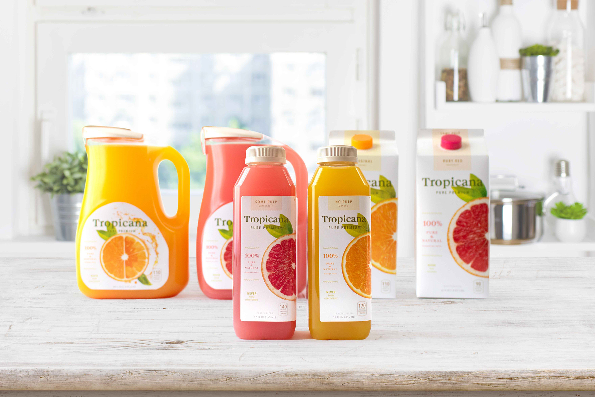
Tropicana's commitment to making the best orange juice in the world goes beyond what's inside the bottle. Which is why my goal for Tropicana’s rebrand, was to increase shelf impact by focusing on the refreshing and superior quality that Tropicana products have to offer.

To attract a millennial audience and retain current customer loyalty, understanding why Tropicana's package rebrand failed in 2009 was crucial.
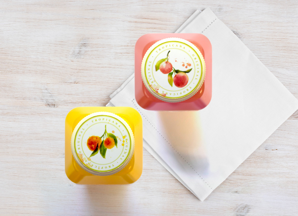
My research revealed this was due to two significant visual changes, the orientation of the logo, over-simplification of imagery, and most importantly, underestimating the deep emotional bond customers have with the original packaging. With this in mind, learning what illustrations could best embody the feeling of drinking Tropicana products and moving away from generic imagery.
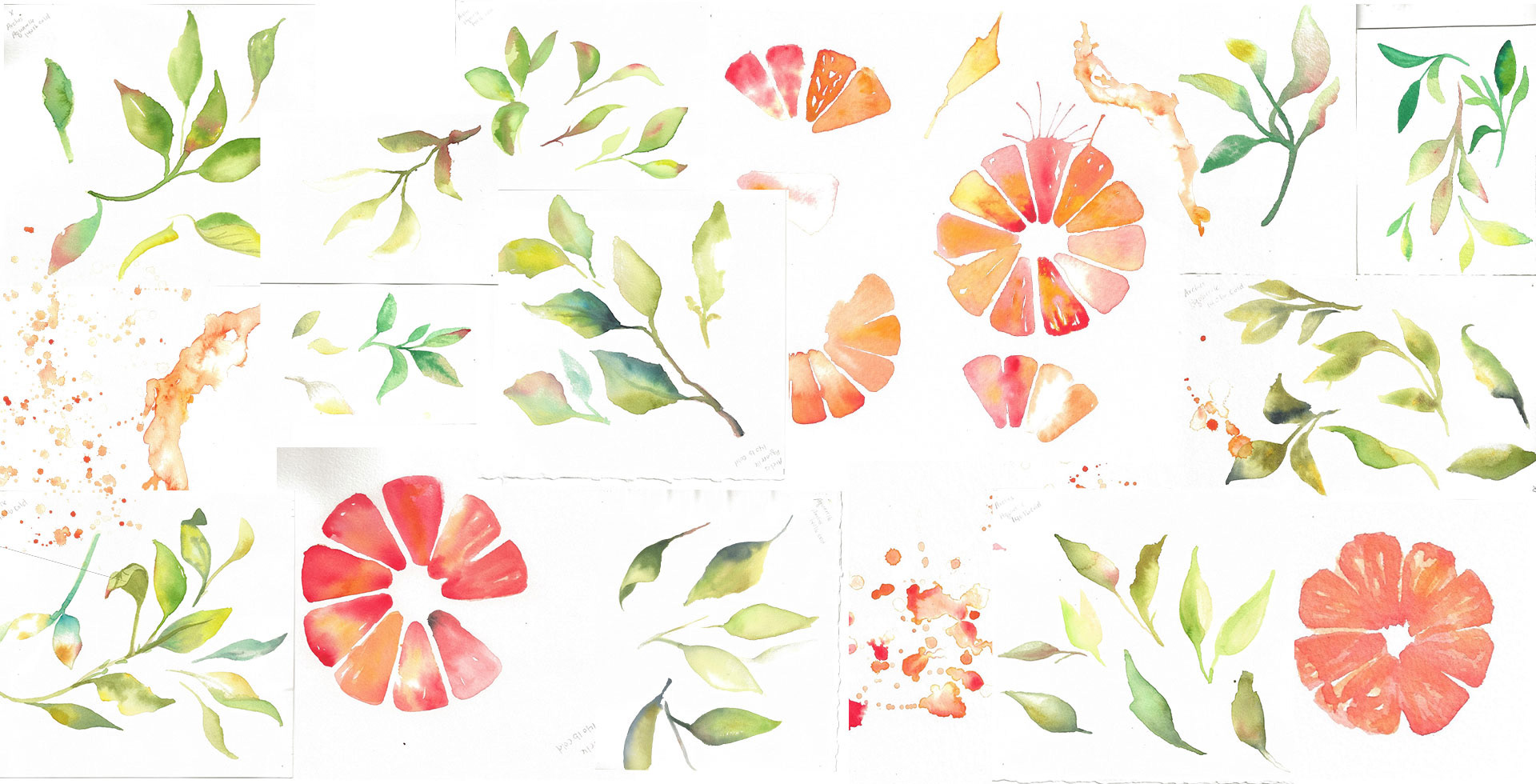
I painted over 60 pages of watercolor explorations and then scanned them at high resolution. Then, it was digitally retouched for the final results below.
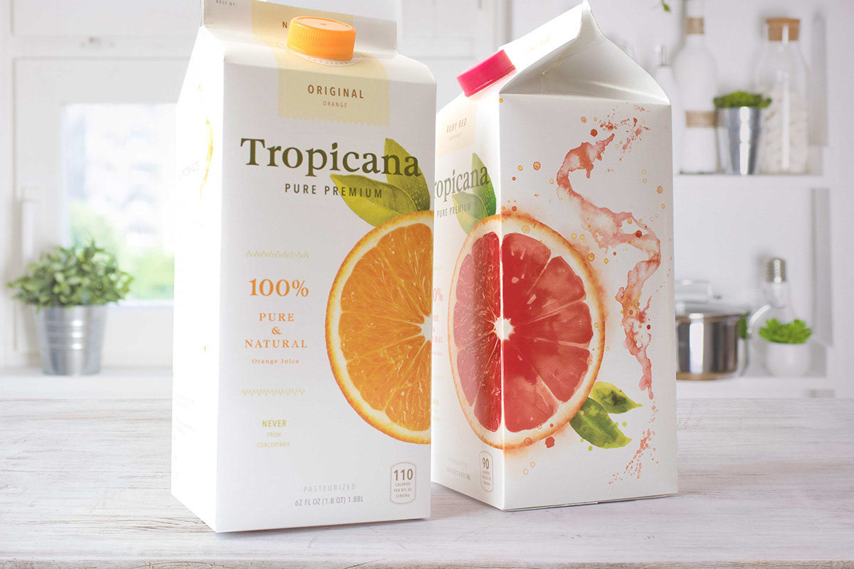
To reflect Tropicana's refreshing quality, the artwork created flow from photography to illustration. Delicately using watercolor as a medium to express the ideology and consciousness of what it is to drink Tropicana's refreshing juice.
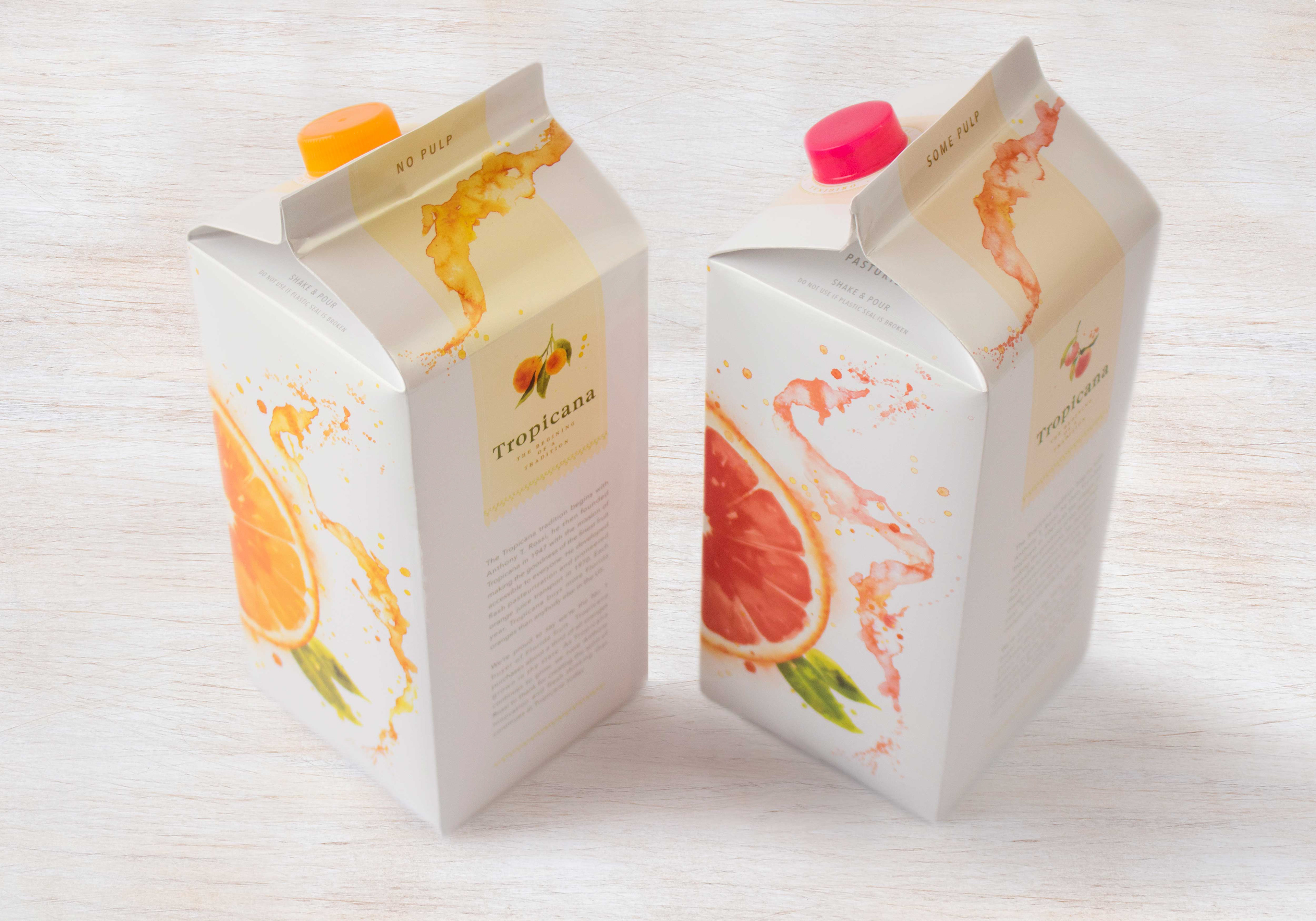
To optimize packaging space, the back panel of the packaging is used to inform new customers of the products' heritage, quality, and nutritional properties. When standing side by side in aisles, the new look is sure to make a splash!